
SwiftUI, Apple’s declarative framework for building user interfaces, revolutionizes the way developers create interactive elements. One such essential component is the button. In this article, we will explore the ins and outs of creating and handling buttons in SwiftUI, providing you with code examples to help you master this fundamental UI element.
Creating a Button:
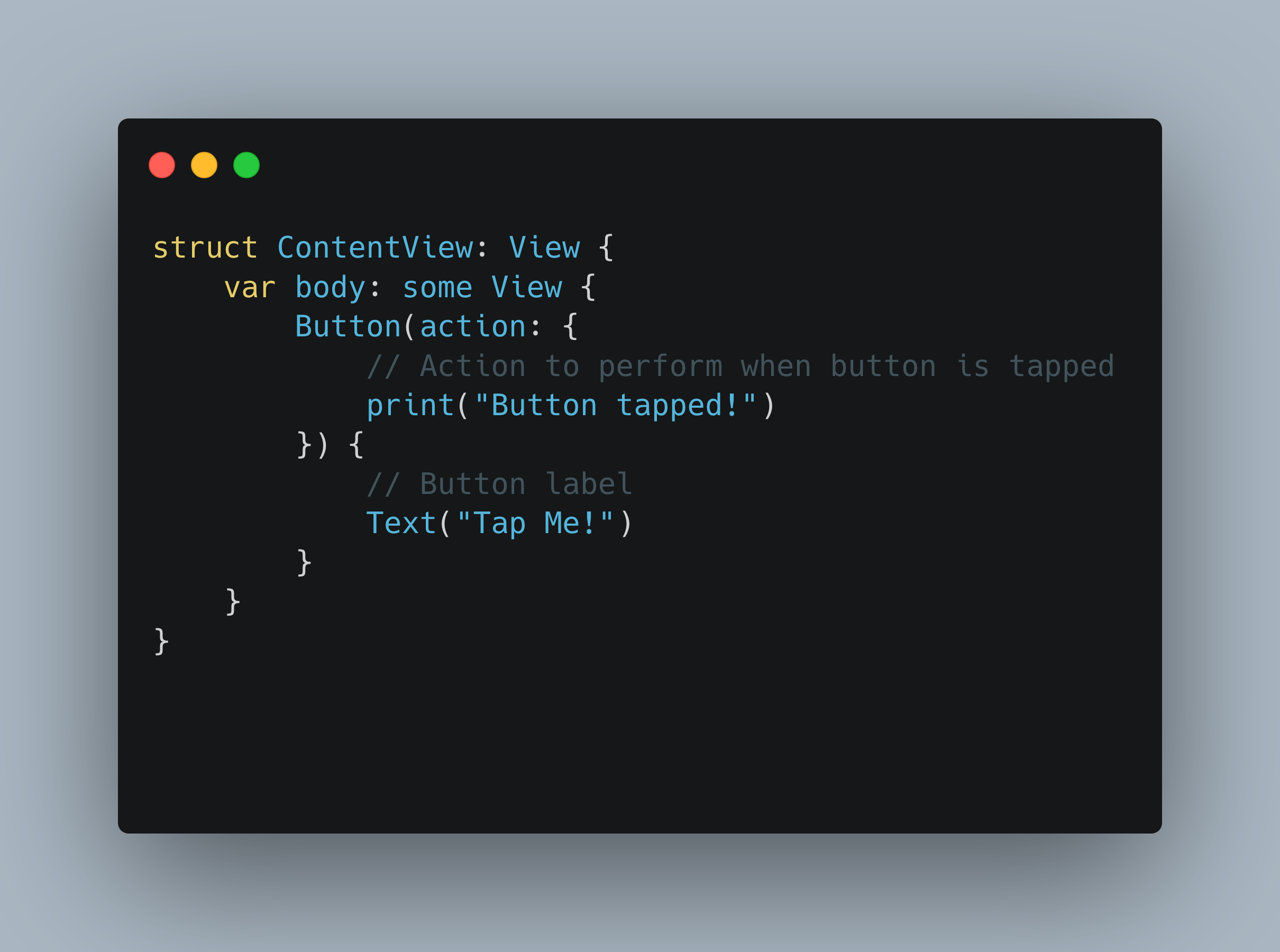
In SwiftUI, creating a button is as simple as using the `Button` view. Let’s take a look at a basic example:
import SwiftUI

struct ContentView: View {
    var body: some View {
        Button(action: {
            // Action to perform when button is tapped
            print("Button tapped!")
        }) {
            // Button label
            Text("Tap Me!")
        }
    }
}
In the code snippet above, we define a `Button` view with an associated closure, known as the action, which will be triggered when the button is tapped. Inside the closure, we can perform any desired action, such as printing a message.
Customizing a Button:
SwiftUI allows extensive customization of buttons. You can modify various aspects, including appearance, text style, and interaction behavior. Here’s an example showcasing some common customization options:
Button(action: {
    // Action to perform when button is tapped
}) {
    // Button label
    Text("Tap Me!")
        .font(.title)
        .foregroundColor(.white)
        .padding()
        .background(Color.blue)
        .cornerRadius(10)
}
In the code snippet above, we modify the button’s appearance by changing the font size, text color, padding, background color, and corner radius. Feel free to experiment and adapt to your app’s style.
Handling Button Taps:
Apart from the basic button creation, SwiftUI provides several ways to handle button taps. Let’s explore two commonly used approaches:
1. `Button(action:)` Closure:
As seen in the previous examples, you can use the `Button(action:)` closure to execute a specific action when the button is tapped. Inside the closure, you can perform any desired functionality, such as updating UI elements, triggering animations, or navigating to a new view.
2. `@State` Property Wrapper:
Another approach is utilizing the `@State` property wrapper to bind a boolean value to the button. Let’s see an example:
struct ContentView: View {
    @State private var isTapped: Bool = false

    var body: some View {
        Button(action: {
            // Toggle the isTapped state
            self.isTapped.toggle()
        }) {
            Text(isTapped ? "Tapped" : "Not Tapped")
        }
    }
}
In the code snippet above, we bind the button’s label to the `isTapped` state property. When the button is tapped, the `isTapped` state toggles, and the button’s label updates accordingly.
Conclusion:
Buttons are vital components in any user interface, and SwiftUI simplifies their creation and handling. By leveraging the `Button` view and various customization options, you can create visually appealing and interactive buttons. Additionally, SwiftUI offers different ways to handle button taps, allowing you to perform actions and update UI elements effortlessly.
Now armed with the knowledge and code examples provided in this article, you are well on your way to mastering button creation and handling in SwiftUI. Happy coding!